


Pantone Colour of the Year 2026 Controversy
Pantone Colour of the Year 2026 Controversy
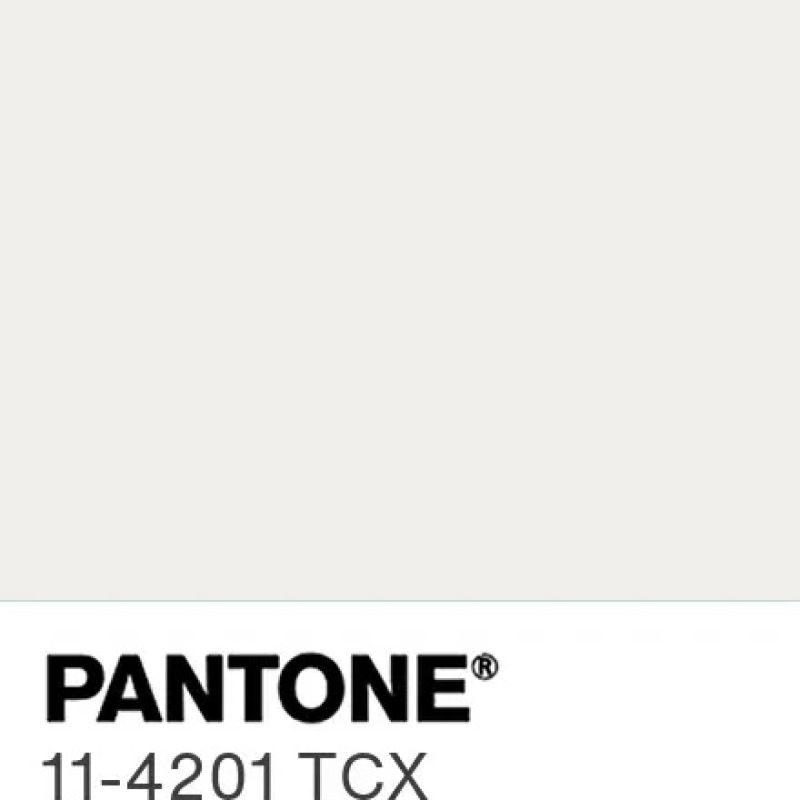 For those of you who love to be on trend, and for those of you who are not in the know, the Pantone colour of 2026 is Cloud Dancer 11-4201. A lofty white neutral whose aerated presence acts as a whisper of calm and peace in a noisy world
What is the Pantone Colour of the Year?
The Pantone paint and colour of the year program, engages the design community and colour enthusiasts in a conversation around colour, highlighting the relationship between colour and culture. Each year they select to colour that captures the Global Zeitgeist, which expresses a global mood and attitude, reflecting collective desire in the form of a single distinct hue.
Surprisingly this year they chose a shade of white, "a lofty white that serves as a symbol of calming influence in a society rediscovering the value of quiet reflection. A billowy white imbued with serenity, PANTONE 11-4201 Cloud Dancer encourages true relaxation and focus, allowing the mind to wander and creativity to breathe, making room for innovation"
What was the public response to the 2026 Pantone Colour of the Year Cloud Dancer?
The public response to the announcement of the 2026 Pantone Colour of the year Cloud Dancer on the internet was one of derision, renaming it everything from Landlord white, unseasoned chicken, institutional white to Ku Klux Klan white and everything in between, they even posed the question, is white even a colour?
The social media memes was equally entertaining, leaving me in stitches, which was the highlight of my slow day of sales, at a face to face event, where I found myself questioning my life choices.
Whilst drinking my darkest of dark cacao and black coffee combo, enjoying a good giggle with all the posts, memes and comments on Instagram, I thought I would let the hysteria die down, before adding my two pennies worth, especially after Pantone felt the need to wheel out a sista to try and justify their colour choice.
If you have to explain something you're really on a hiding to nothing!!!

PANTONE Colour of the Year Cloud Dancer 11-4201
"PANTONE 11-4201 Cloud Dancer encourages true relaxation and focus, allowing the mind to wander and creativity to breathe, making room for innovation."
What is my response to the Pantone Colour of the Year Cloud Dancer?
As a jeweller, with a passion for gemstones, and their healing energises and power, I'm attracted to colour, asterism, labradoressence and chatoyancy, the characteristics of the stones that make them pop and stand out from the crowd. My jewellery is designed for those who don't want to conform, the lone wolf, who wears their jewellery as a statement, declaring their unique style from the roof tops.
But for those who live by the Pantone colour of the year, I do love a challenge and soon I realised that I still have some wriggle room, when it came to my gemstone choices in my handcrafted jewellery.
The most obvious stone that encapsulates the Pantone 2026 colour would be Moonstone, a stone for new beginnings, especially Rainbow Moonstone, as it captures the essence of the Cloud Dancer, especially with its labradoressence:
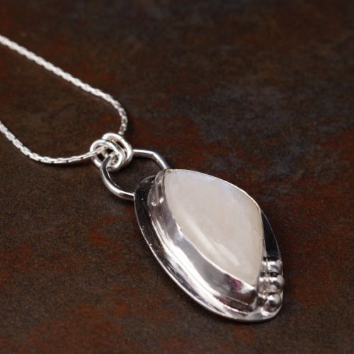
Handcrafted recycled sterling silver bezel set pebble Rainbow Moonstone
An alternative stone is Selenite, with its cat's eye optical illusion providing some interest and mystery to the blank white canvase of the stone:
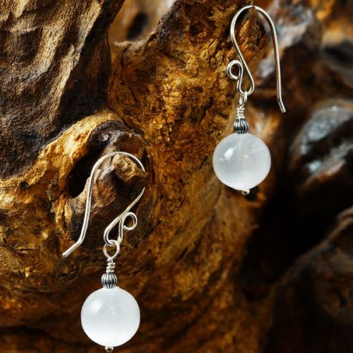
Handmade recycled sterling silver wire wrapped Selenite earrings
What is my take on the Pantone Colour of the year 2026 Cloud Dancer Palettes?
With all these things Pantone also added a number of palette to compliment the Cloud Dancer Colour:

Which apart from the Blue Fusion, blue is my favourite colour so maybe I'm a bit bias, doesn't really excite me that much, they just really look washed out, and feels like there's no commitment!!!
According to Pantone "Offering more than meets the eye, PANTONE 11-4201 Cloud Dancer evokes gentle pleasure without overstimulation. Explore curated colour harmonies and discover its endless design possibilities", the 7 other palettes, do not wow me, and if I'm completely honest I find most of the colours within them boring.
Here's the 7 other palettes with brief explanations:

POWDERED PASTELS
Pastel and neutral tones offering subtle shifts in hue that are nuanced, pleasing, and understated

TAKE A BREAK
Inviting us to take a break, tempting us to taste a variety of hues in whatever shade moves us, all making for a playful palette
The only colour that really pops for me is the papaya and the pink lemonade

ATMOSPHERIC
Lifts us to lofty heights where this diaphanous white breaks through grey skies revealing clear, breezy blues under a misted sunlight. Aqueous blue-greens emanate from the watery depths

COMFORT ZONE
A place to disconnect, to unwind and decompress. The natural and organic colours are embracing and inclusive, rendering a sense of reaffirming repose.
That said, nothing is achieved in the Comfort Zone, this is a place where dreams die, and this palette, really seems to embody this, with these murky colours.

TROPIC TONALITIES
When we imagine the tropics, vivid colours come to mind: a turquoise ocean, sparkling citrusy refreshment, bright florals, and exotic birds. If there is a cloud in this sunlit paradise.
When I look at this palette although exciting as we have vivid colors, it doesn't feel tropical at all, just reminds me of my mispent youth at raves and house parties.
That said this palette has the most potential, as the Blazing Yellow would be a fabulous match for Citrine, the Sunny Lime is reminiscent of Peridot, Bright Marigold wold be a fabulous Carnelian, whilst the Paradise pink would be an awesome Pink Sapphire.

LIGHT & SHADOW
Blends into a veiled palette of softened hues that ultimately dissolve into shadowy shades, producing an easy and effortless contrast in colour

GLAMOUR & GLEAM
The yin of white inevitably meets the yang of black, accented by a sultry lipstick red. The glamour is heightened by vintage wine and teal, glimmering graphite, shimmering grey, and a silvery satin metallic
This palette has the most potential for me with it rich, luxurious jewel colours, but it still misses the mark, again looking very murky.
How have my customers reacted to the Pantone Colour of the Year controversy?
Interestingly, a lot of the internet has ignored the Cloud Dancer colour choice and decided the the 2026 colour of the year is a deep rich green/teal colour, which the Pantone Dragonfly would be the closest.
At my markets since the Pantone 2026 Cloud Dancer colour dropped, one of my best selling stones, rainbow moonstone, especially the rings and studs, have been dumped, with my customers choosing jewellery with deeper rich luxurious colours, including the more deeper greens, including green tourmalne, moss agate, bloodstone and natural emeralds and juicy dark red garnets.
What's your thoughts on both the 2026 Pantone Colour and Palettes?
I would love to hear your comments below
Joolz xxx
2 Comments


![]()


